The status view
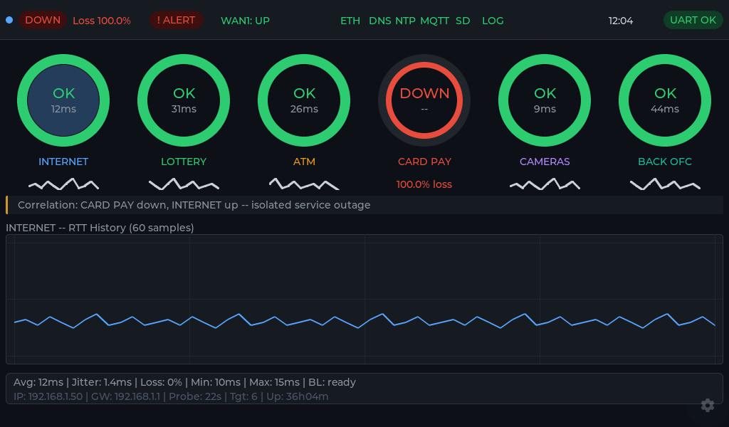
This is what a single site looks like at a glance. Every service the sensor watches gets a ring; green is healthy, red is down, and the number is the current round-trip time from the counter.
How to read it
- The rings - one per monitored service (internet, card pay, cameras, back office…). The label under each is what you named it; the number is live latency.
- The correlation line - when several things fail together it says so, and when only one does it isolates it (“CARD PAY down, INTERNET up - isolated service outage”), so you are not chasing the wrong thing.
- The RTT history - the last 60 samples for the selected service, so a slow creep is visible before it becomes an outage.
- The footer - average, jitter, loss, and the sensor’s own IP / gateway / uptime, for when you need the details.